Motion identity across online, broadcast & in-store video
Services: Motion Strategy, Motion Design
Deliverables: Broadcast Video Files, Motion System Guidelines, Production Templates
—
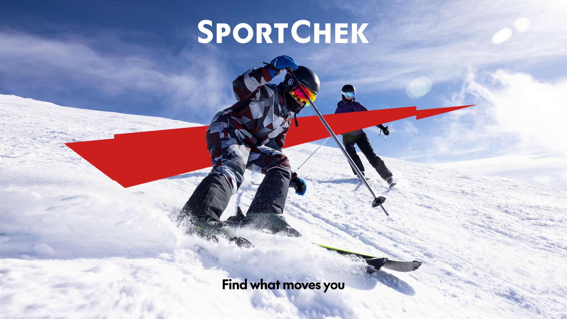
Sport Chek brought me in to develop all the motion design within their brand system refresh. They were going bolder—expanding on the familiar “Chek Box” and focusing the whole system around those graphic elements and a single, unifying typeface.
The ask was to find the motion opportunities provided by their new brand foundations designed in-house. A new motion for their emboldened Chek. A dynamic treatment for their new framing device. An ownable type animation approach. It all came together to push Sport Chek’s motion content to become more dynamic, yet consistent and flexible.

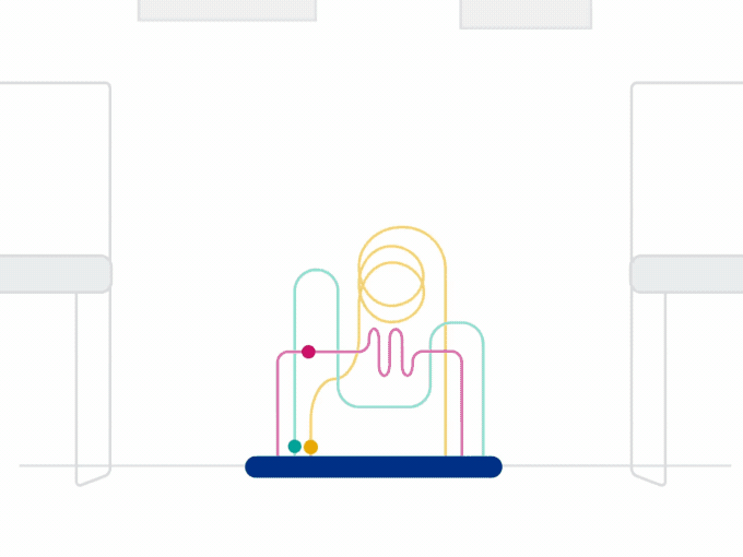
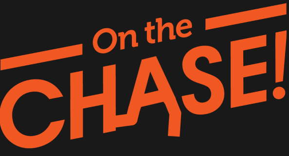
New Chek Animation
Inspired by the rhythm and energy of a heartbeat. A unifying, human element across all types of sport. This motion imbues the brandmark with fresh movement while staying compact and efficient on-screen.
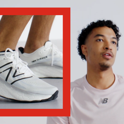


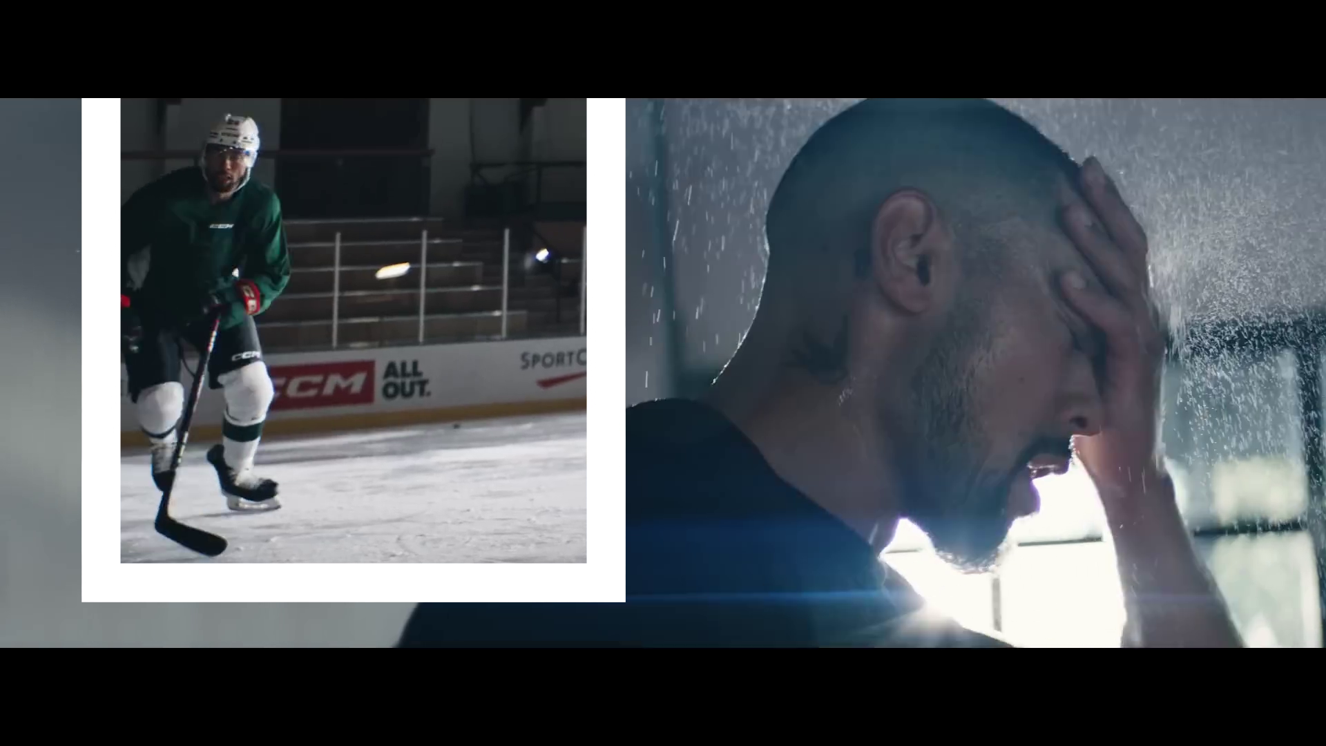
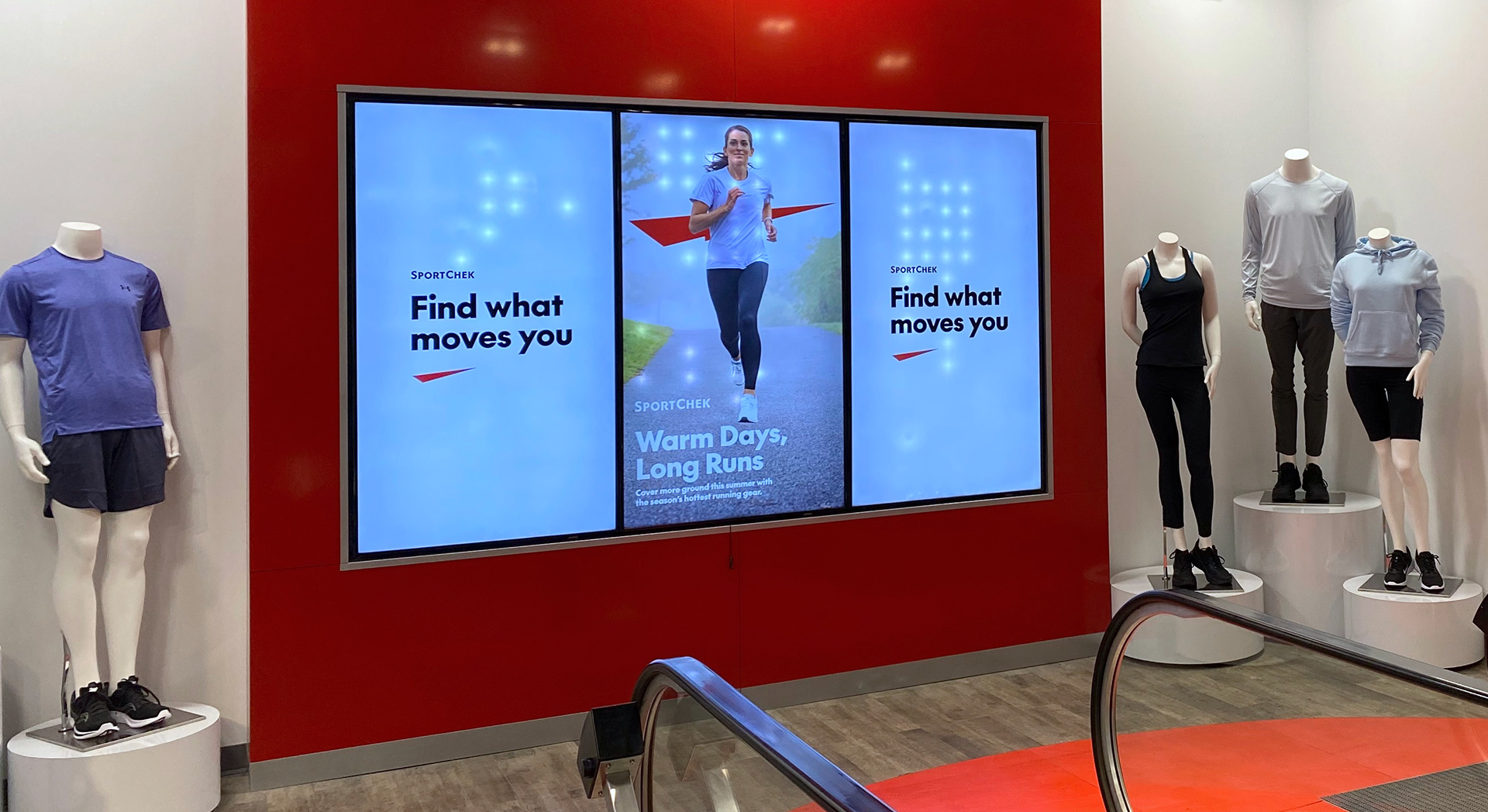
Working in close collaboration with the in-house Brand Design & Systems team, I produced new brand examples across online, broadcast and in-store video content. The resulting guidelines create more flexibility for their in-house production team—meaning more assets and variations are now available for more types of video.
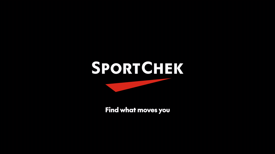
The official End Frame Animation is a perfect example. Previously, Sport Chek had a 7 sec logo animation available only on black, in a widescreen ratio. Today’s video demands require more flexibility, and preset versions save production time. The system now contains 2 sec stings, up to full 7 sec logo animations with text options. All are officially available in 3 colours, and multiple size ratios.

CREDITS
Creative Direction, Motion Design/Animation: Julian Brown
Client: Sport Chek (Canadian Tire Corporation)Canadian Tire - Design Director, Manager Brand Design & Systems: Caroline Bruckner
In collaboration with the Canadian Tire In-House Brand System Design Team / T3